
When I wrote my Financial Review piece on how $A8.9 billion of Apple’s Australian sales revenue from 2002-2013 ended up as profit with Apple Sales International, I hadn’t noticed that Apple pays more tax in Australia than it pays in Ireland.
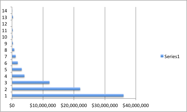
In Ireland, from 2002 to 2011, Apple Sales International reported $US 45.6 billion profit, on which it paid $US63.2 million tax. Over the decade the tax rate didn’t just drop. It broke the sound barrier on the way down. These are ASI’s year by year earnings over the decade:
| Apple Sales International | |||
| Year | Pre-tax profit $US000 | Tax provision $US000 | Tax rata % |
| 1999 | $42,550 | $464 | 1.09% |
| 2000 | $292,554 | $8,475 | 2.90% |
| 2001 | No figures available | ||
| 2002 | $213,771 | $4,107 | 1.92% |
| 2003 | $165,389 | $2,093 | 1.27% |
| 2004 | $267,889 | $2,147 | 0.80% |
| 2005 | $725,294 | $3,908 | 0.54% |
| 2006 | $1,179,637 | $6,484 | 0.55% |
| 2007 | $1,843,933 | $8,928 | 0.48% |
| 2008 | $3,126,952 | $14,923 | 0.48% |
| 2009 | $4,003,464 | $3,651 | 0.09% |
| 2010* | $12,100,000 | $7,000 | 0.06% |
| 2011* | $22,000,000 | $10,000 | 0.05% |
| 2012* | $36,000,000 | ||
| Figures from Apple Sales International filings | |||
| * Figures from US Senate Committee of Homeland | |||
| Security and Governmental Affairs Permanent | |||
| Subcommittee on Investigations May 2013 | |||
Using the most rudimentary of graphs, Apple Sales International’s pre-tax profits go up like this:
While the tax rate as the percentage of profit that Apple Sales International goes down like this:

Meanwhile Apple Australia sold $26.7 billion of Apple products in Australia from 2002 to 2013 and reported $193 million of tax provisions (the cashflow statements show Apple Australia actually paid $335 million tax, no doubt after some friendly badinage of the sort the Australian Tax Office is famous for).
Taking stock: My Financial Review piece has not been contested by Apple. At least, not on the record. Here’s why the methodology works–for Australia, and for any other country outside the US that can work out howe much their local Apple distributor paid ASI as :cost of goods” (they report that in Australia but not in European filings).
I originally worked up most of the material in May 2013, when I put the methodology to Apple. Their reply was that there were too many assumptions in my analysis to make any sort of response. They said the same thing two weeks ago when I updated my figures and put revised material to them. Since then they haven’t said anything at all.
To date the only critical response on the figures has come from Fortune Magazine’s Philip Elmer-DeWitt, who has been following Apple for longer than I have been following News Corporation. He made an entirely reasonable point:
One caveat: The financial statements the Review obtained only cover the years 2000 to 2009. Its editors had to extrapolate in order to extend the data to 2013. And because the really big money started pouring in after 2009, those eye-popping numbers in the 2010-2013 charts should be taken with a grain of salt.
The short answer is that it really doesn’t matter what you do to extrapolate the data, the results are always going to be eye-popping. What’s driving this outcome is the absolutely explosive growth in Apple sales all around the world, including Australia.
Apple Sales International’s pre-tax profit went from $US4 billion in 2009 to $US36 billion in 2012. You can make any ultra-conservative and wacky assumptions you like. Believe me, I tried. And the total for Australian income that ends up with ASI is still more than $A8 billion.
Saying that longer:
I wrote about the method here but in the end the interactive graphic by Ed Tadros and Les Hewitt with the original story tells it simplect.
To recap: I obtained the financial returns for Apple Sales International from 1999 to 2009. By applying ASI’s gross margin to the amount Apple Australia reported each year as it cost of sales (i.e. how much it paid ASI for Apple products) I was able to calculate the amount of mark-up ASI had charged as profits for intellectual property and intangibles, on its Australian sales.
| Apple Pty Ltd Cost of goods | ASI margin | Australian gross margin paid to ASI | |
|
2000 |
240,635 |
19.3% |
$46,443 |
|
2001 |
181,931 |
||
|
2002 |
188,223 |
24.3% |
$45,738 |
|
2003 |
194,737 |
21.6% |
$42,063 |
|
2004 |
286,128 |
21.9% |
$62,662 |
|
2005 |
479,815 |
24.9% |
$119,474 |
|
2006 |
609,676 |
26.7% |
$162,783 |
|
2007 |
733,454 |
30.9% |
$226,637 |
|
2008 |
1,002,124 |
34.9% |
$349,741 |
|
2009 |
1,775,110 |
38.9% |
$690,518 |
|
2010 |
3,269,556 |
||
|
2011 |
4,414,698 |
||
|
2012 |
5,498,330 |
||
|
2013 |
5,573,150 |
||
| 2002-09 |
$1,699,617 |
As I noted, you can use the same approach to calculate the profit number that goes to Ireland, for each country outside the US, if you can get the local cost of sales figure. Australia is fortunate here.
So here’s my problem: what happens when the data for Apple Sales International runs out in 2009?
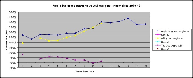 You will see from the legend at the side that my mastery of Excel’s graphing function is a little less than stellar. But you get the idea. In the course of the decade that I did have figures for, it becomes clear that ASI’s gross margins (the yellow line) were connected to, and were converging with, the gross margins of the worldwide group. Apple Inc(the blue line). The purple line is the size of the gap, which is going down. This isn’t surprising—foreign sales (i.e. ASI’s sales) grew from 43 per cent of AppleInc’s worlddwide sales in 2001 to 63 per cent in 2013.
Comparing ASI’s gross margin and Apple Inc’s gross margin:
The highest gap in the eight years was 5.9 per cent in 2003
From 2002 to 2009, the gap was an average 3.0 per cent
From 2006 to 2009, the gap was an average 1.3 per cent
Worst case: So this is what the graph looks like if from 2010 onwards we assume that ASI’s margin was 5.9 per cent lower than Apple Inc’s gross margin. That’s the largest gap it has ever been in the decade before.

It really doesn’t work as a chart, does it? The result is artificially low at the right where the 5.9% assumption kicks in.
What the first decade of results suggests, and other recent measurements support, is that the yellow line, ASI’s margins, should be at least as high as the dark blue line, Apple Inc’s margin. In fact ASI’s margin was probably higher.
Instead, I looked at the period from 2006 to 2009, when over average Apple Inc’s margin was 1.3 per cent higher than ASI’s margin. Then I increased that figure to 2 per cent. So each year from 2010 to 2013 I assumed ASI’s gross margin would be 2 per cent less than the Apple Inc margin.
The result looks like this:
That’s a conservative estimate.
| Apple Pty Ltd Cost of goods $A000 | Apple Inc overall gross margin | ASI margin (6% discount from 2010-13) | Australian gross margin paid to ASI $A000 | |
|
2000 |
240,635 |
27.1% |
19.3% |
$46,443 |
|
2001 |
181,931 |
23.0% |
||
|
2002 |
188,223 |
27.9% |
24.3% |
$45,738 |
|
2003 |
194,737 |
27.5% |
21.6% |
$42,063 |
|
2004 |
286,128 |
27.3% |
21.9% |
$62,662 |
|
2005 |
479,815 |
29.0% |
24.9% |
$119,474 |
|
2006 |
609,676 |
29.0% |
26.7% |
$162,783 |
|
2007 |
733,454 |
33.2% |
30.9% |
$226,637 |
|
2008 |
1,002,124 |
34.3% |
34.9% |
$349,741 |
|
2009 |
1,775,110 |
40.1% |
38.9% |
$690,518 |
|
2010 |
3,269,556 |
39.4% |
37.4% |
$1,222,814 |
|
2011 |
4,414,698 |
40.5% |
38.5% |
$1,699,659 |
|
2012 |
5,498,330 |
43.9% |
41.9% |
$2,303,800 |
|
2013 |
5,573,150 |
37.6% |
35.6% |
$1,984,041 |
|
$8,909,932 |
This puts Australian sales revenue that ends up retained as income by Apple Sales International at $A8.9 billion.
Consider instead the extreme case. Rather than assuming the gap between ASI and Apple Inc’s margins is not 2 per cent but 6 per cent. That’s higher than the largest gap reported in the decade before, applied every year for the four years 2010-13.
The result is this:
| Apple Pty Ltd Cost of goods $A000 | Apple Inc overall gross margin | ASI margin (6% discount from 2010-13) | Australian gross margin paid to ASI $A000 | |
|
2000 |
240,635 |
27.1% |
19.3% |
$46,443 |
|
2001 |
181,931 |
23.0% |
||
|
2002 |
188,223 |
27.9% |
24.3% |
$45,738 |
|
2003 |
194,737 |
27.5% |
21.6% |
$42,063 |
|
2004 |
286,128 |
27.3% |
21.9% |
$62,662 |
|
2005 |
479,815 |
29.0% |
24.9% |
$119,474 |
|
2006 |
609,676 |
29.0% |
26.7% |
$162,783 |
|
2007 |
733,454 |
33.2% |
30.9% |
$226,637 |
|
2008 |
1,002,124 |
34.3% |
34.9% |
$349,741 |
|
2009 |
1,775,110 |
40.1% |
38.9% |
$690,518 |
|
2010 |
3,269,556 |
39.4% |
33.4% |
$1,092,032 |
|
2011 |
4,414,698 |
40.5% |
34.5% |
$1,523,071 |
|
2012 |
5,498,330 |
43.9% |
37.9% |
$2,083,867 |
|
2013 |
5,573,150 |
37.6% |
31.6% |
$1,761,115 |
|
$8,159,702 |
The total Australian sales revenue that ends up retained as income by Apple Sales International falls to $A8.159 billion. It’s an 8 per cent variation from the $8.9 billion figure I used. It’s still $8-billion-plus.
In reality the true number is probably more than $9 billion. But changing the assumptions doesn’t do much to the outcomes. I think you could correlate ASI’s margins almost to any series of random numbers and the outcome would still be eye-popping. Because the process is being driven not by margins, but by the wave of money that washed towards Apple from its booming iPhone and iPad sales.
